THE ADDRESS OF MY BLOG HAS CHANGED >>>
FROM NOW ON YOU CAN FIND ME AT
WWW.TELEPHONEBOOK.wordpress.com
See ya in there ... :)
Ste
December 30, 2010
December 06, 2010
NGO Campaign : Can we change something ?

During the last couple of weeks I have been researching for advertisements
for my 1st term project at LCC, that saw students designing a 15 pages pdf presentation about their
researches. The class was divided in several group with differet tasks .
My group task was : Design a Campaign for a Non Governmental Organization
the message is "Become greener"
the target audience is 30 to 50 years old working class man
The research has brought along with its branches, a number of questions which I wasn't able of
answer neither doing surveys or consulting particular studies. I am now wondering about couple of things I'd like to share with you .
How good it is to show people that if they recycle they are hero ?
Isn't it simply what they are supposed to do ?
If we use the hero technique, isn't people going to keep thinking about it as a cliche' ?
Aren't they going to be careful to the issue just in public occasion ?

Famous brands and are making now as in the recent past, usage of this messages to promote eco-sustainable products that in the case of Timberland are effectively innovative.
But aren't them doing what they are supposed to ???
Aren't they sending a message that says we are out of the normal?
Looking at many campaigns I also got the impression that all these powerful and heavy
messages cannot be effective for a long period of time. The reason is that human beings
cannot live in a continuos state of anxiety, so they ( us) end up deleting the messages to
carry on living their everyday lives, without thinking that the world is
going to collapse on them in a minute..
What makes this kind of campaigns working is apart from the graphic design ... the fact
that people talks about them. It is by talking about or referring to it in conversations
that the audience familiarise with the concept and resize it to a smaller manageable scale.
The question is, can we design campaigns able to target the boarder lines layers of the
audience without running into extremes ?
Can we create a campaign that works on its own by giving to the audience a new perce-
ption of the issue that breaks from the type of messages they are nearly fade up with ?

Could it be that campaigns whose content was structured for young folks is in reality
starting to work more for adults instead of younger individuals ?
November 13, 2010


THOMAS NEULINGER's experimental Posters
.
Thomas Neulinger on Behance >> LINK
Beautiful experimental posters.

Thomas Neulinger on Behance >> LINK
Beautiful experimental posters.
A mix of illustrationsand graphic design workthat captures my attention
Because of its space approach and boldness.
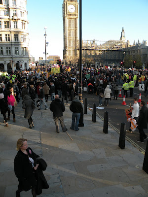
Student protests against cuts to education
Last week in central London students from all around Uk met to protest against the education cuts beign imposed by the government.
Despite vandalisms, the manifestation saw students marching in the streets in a colourful procession.
It was a nice occasion to meet lots of people and make a point on the situation.
An interesting thing was that students of different nationalities and backgrounds were together exchanging opinions and informations on their respective points of view about what's happening not only in Uk.
What has emerged from this views exchange, is that lots of students are seriously concerned with the actual situation in the world.
Here is a link to the Guardian with a video from the most °lively° actions from the protest.
This kind of actions aren't completely useless because they rise the attention of the media and audience too.
But let's remember that we need to take concrete actions, {which have nothing to do with breaking windows} to ensure ourself and our new generations a better future instead of a newer version of the old story.


Teaganwhite web-portfolio
The web site offers a number of projects mainly illustration based.
Very nice usage of colours and a lovely retro touch !
Impressive illustrated fonts which I am sure will capture your attention.


http://www.teaganwhite.com/index.html
November 08, 2010
November 06, 2010
Bad news from the AI WEIWEI front !!!

Photo : Tate Modern AIiweiwei signboard.
Couple of weeks ago I went to see the Unilever Series at Tate Modern. A 100.000.000 hand made sunflower seeds, placed in the turbine hall of the museum.The singularly hand made seeds, are very much a metaphor which the artist uses to show us the importance of the singular individual into his own cultural background. Sunflower seeds were in China one of the symbols of the revolution.They are part of the chinese history and represents here the chinese people. I have really enjoyed the work and the documentary which is shown next to the
massive installation and I support the intelligence of this artist, which work is forbidden in his own country
( China).
I first thought I wasn't going to to a post about it, just coz I knew it was going to be publish anyway in planty of blogs. Anyhow a few minutes ago I discovered that the artist was today arrested and beaten up by the chinese local authorities.The reason for being forced to house arrest' is an exhibition space
which the artist built within his studio space. If you want to know more here is the link to BBC news > LINK
November 04, 2010
Working Class Hero-John Lennon
During last Friday session, the first real brief of the academic year has been given to students / how exiting !!
We were divided by groups and we were asked to select our brief from a set of options.
CLIENT: 6 options
TARGET AUDIENCE: 6 options
MESSAGE: 6 options
In order to the select our brief options we had to use a dice ...
The destiny of our group picked by the dice is :
CLIENT: Non governmental organization
TARGET AUDIENCE: working class 30s to 50s
MESSAGE: become greener
I will update you as my research progresses ...
Comments, suggestions and criticisms are always welcome ...
good luck guys !
November 03, 2010
PPD is cool...
What is PPD session ?
Last week we attended the PPD group workshop.
The aim of a PPD session is to allow students to become more familiar with methods for projects evaluation adopted by tutors in our college. We all know it isn't an easy task that of evaluating a graphic design work, as it requires a wide range of skills and knowledges that allows tutors to be objective. To start with, we were provided with a "contents sheet", listing the undergraduates marking criteria. This document is referential to both students and tutors.
During the first part of this group activity we tried to grasp the essence of the university evaluation criteria and we discussed upon each of the listed sections for about ten minutes.
The second part of the session was guided by two colleagues from the second year of college.
It was a good occasion to take a look to both final pieces and notebooks, from these young designers and to ask few questions about our course in a confidential environment .
The morning activity ended with a task that required students to mark some of the final projects from the previous academic year. This task was to me quite a difficult one, because it
is always complicated to judge somebody's work and it is even harder to share yor opinion with others whose opinions maybe quite differents from yours.
I found that the exercise was very helpful and quite far from the idea of college I had in my mind. To take the tutors place it can help us to understand couple of thing about our approach to projects, especially when after the session the tutor provids you with the real marks the students got for the work.
What did make this session so good ?
In the session all we were required to do, was to look at the marking criteria, from a different
prospective.... what I loved about the session was the " shift in consciousness...."
something so simple ...
something so simple ...
something to teach ..not only to designers ...
November 02, 2010


October 27, 2010
Typography workshop 2010

\Last tuesday at Lcc we attended a workshop covering the basics of typography and
language.
The session, aims to explore the basic technical language, which visual communicators
must know and commonly use in their everyday practice.Moreover the students were
asked to analyse the role of the typographer and his diverse subject matters.We were
helped with a series ofexercises, mainly about:
Decomposition/Outlines /Repetition in patterns/Enlargement/ of a letter type.


These exercises gives to students the chance to approach the subject
in a simple but effective manner. No particular skills required,
just have fun and be fast. ..coz time is money you know ...
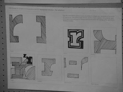
I found that playing with an "R" for 10 minutes can already deliver
unexpected insights.It is kind of amazing how letters can be protagonists
of a struggle to beauty and balance and become to your eyes lines and
shapes that lives of their own. What I mean is, that once you start to play
with them a bit, you are already forgetting about their original meaning
which each of them carries as a symbol, getting into the illustrated side
of the outline shapes and coming then back to their original meaning again.


Robert Bringhurst ( book: The elements of typographic style, version 3.1)
"The typographer's one essential task is to interpret and communicate the text.
Its tone, its tempo, its logical structure, its physical size, all determine the
possibilities of its typographic form.The typographer is to the text as the
theatrical director to the script, or the musician to the score."

The letters of the Western alphabet are built from a system of lines with intricate visual relationships that are nearly invisible. When the text is formed by an appropriate type size, the reader perceive all the letters as they had all the same height, weight and width.
It is of crucial importance to understand that stylistic uniformity discourages distraction during the reading process.
October 20, 2010
Out and About : The Shoreditch side of the Moon

>Last Friday for the " Out & About " session, we were taken by Pr. Paul Bailey around Shoreditch,
to have a look to one of the artistic poles of the city.
Nothing to do ? Stop your drinking / smoking or gaming routine and get out on your feet...
The session aim was to underline the importance of "keeping up to date" as designers
and in doing so we were offered the possibility to view the work from artists which career
has reached top levels; Nice to know that both the two galleries visited in the afternoon
class are FREE !!! no tickets !! Just walk in and enjoy ... plus one of the place
( INVENTORY STUDIO ) which is an advertising agency offers library services on a small
but very cool range of books ( indeed focusing on your favourite subjects ).
Kemistry Gallery 43 Charlotte Road London EC2A 3PD
The White Cube 48 Hoxton Sq London N1 6PB
KK outlet42 Hoxton SquareLondonN1 6PB
Invetory Studio 80a Ashfield Street London E1 2B
/Kemistry


KEMISTRY GALLERY :
Is a unique place where you can find works from cutting edges UK and internationals designers .
Now exhibited is the work from the ex
CBS art director Lou Dorfsman that my text editor underlines in red because it is so ignorant :)
The exhibition which is contained in a small but cool room, features the biggest typographic work of all times;
from Dorfsman titled : Gastrotypographicalassemblage.
Unfortunately, the original work ( a 11 metres long wooden board ), is now being restored.
The gallery expose a giant photo of the work that isn't the greatest thing ever
.. but still impressive.
Within the astonishing care for details which can still be perceived from the photographic
reproduction, the work carries to the viewer a very intense groove. It is one of these masterpieces
showing a life (spent up on a subject),
comparable in my opinion to the masterpiece of a bluesman.

.jpg)

Here are some posters made by L.D
for CBS network.
I could have shown you the classic
CBS logo design but in reality I think
these posters are more interesting.
Centred layout aren't often that interesting to me but I have to admit that his work
it's really clean and beautiful, plus the posters are enriched by the aged paper .... stylish ....
________________________________________________________________________________________
The white cube
COULDN"T FIND A GOOD PICTURE ....
SORRY>>>
score:00
*_* ^_^ "_" +_+ -_-
.
.
_
THE WHITE CUBE Gallery, is currently exhibiting the work of Mark Bradford a LA based american artist. The reason to do not publish any picture is that I prefer you to check out his website Pinocchioinonfire.org /I am telling you ... despite the music which some may not enjoy ( I did ) the website is really cool. The webspace features interviews with the artist .... good choice !!Bradford started his main projects during the early 90s and has produced in 2010 a work titled "You are nobody ( until somebody kills you ).

M>B. shares or better recycle works from graphic designers collected around the studio allowing them to gain new life and meaning through his work. It is interesting how posters with other related materials becomes part of the artist work, being technically utilised in the process as well as inspiring the artist too.
Subscribe to:
Posts (Atom)