October 27, 2010

Typography workshop 2010


\Last tuesday at Lcc we attended a workshop covering the basics of typography and    
  language. 
  The session, aims to explore the basic technical language, which visual communicators     
  must know and commonly use in their everyday practice.Moreover the students were 
  asked to analyse the role of the typographer and his diverse subject matters.We were 
  helped with a series ofexercises, mainly about: 


     Decomposition/Outlines /Repetition in patterns/Enlargement/ of a letter type.


    These exercises gives to students the chance to approach the subject 
    in a simple but effective manner. No particular skills required,
    just have fun and be fast. ..coz time is money you know ...
    
   
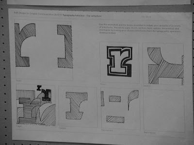
   I found  that  playing with  an "R" for 10 minutes  can  already  deliver 
   unexpected insights.It is kind of amazing how letters can be protagonists
   of a struggle to beauty and balance and become to your eyes lines and 
   shapes that lives of their own. What I mean is, that once you start to play 
   with them a bit, you are already forgetting about their original meaning 
   which each of them carries as a symbol, getting into the illustrated side 
   of the outline shapes and coming then back to their original meaning again.  


   Robert Bringhurst ( book: The elements of typographic style, version 3.1)
   "The typographer's one essential task is to interpret and communicate the text.
   Its tone, its tempo, its logical structure, its physical size, all determine the
   possibilities of its typographic form.The typographer is to the text as the
   theatrical director to the script, or the musician to the score."


The letters of the Western alphabet are built from a system of lines with intricate visual relationships that are nearly invisible. When the text is formed by an appropriate type size, the reader perceive all the letters as they had all the same height, weight and width.
It is of crucial importance to understand that stylistic uniformity discourages distraction during the reading process.


October 20, 2010

Out and About : The Shoreditch side of the Moon


>Last Friday for the " Out & About " session, we were taken by Pr. Paul Bailey around Shoreditch, 
to have a look to one of the artistic poles of the city. 
Nothing to do ? Stop your drinking / smoking or gaming routine and get out on your feet... 
The session aim was to underline the importance of "keeping up to date" as designers 
and in doing so we were offered the possibility to view the work from artists which career
 has reached top levels; Nice to know that both the two galleries visited in the afternoon 
class are FREE !!! no tickets !! Just walk in and enjoy ... plus one of the place 
( INVENTORY STUDIO ) which is an advertising agency offers library services on a small
 but very cool range of books ( indeed focusing on your favourite subjects ).


                       Kemistry Gallery 43 Charlotte Road London EC2A 3PD
                       The White Cube 48 Hoxton Sq London N1 6PB
                                 KK outlet42 Hoxton SquareLondonN1 6PB
                             Invetory Studio 80a Ashfield Street London E1 2B


/Kemistry


KEMISTRY GALLERY : 


Is a unique place where you can find works from cutting edges UK and internationals designers .
Now exhibited is the work from the ex 
CBS art director Lou Dorfsman that my text editor underlines in red because it is so ignorant :) 
The exhibition which is contained in a small but cool room, features the biggest typographic work of all times; 
from Dorfsman titled : Gastrotypographicalassemblage.
Unfortunately, the original work ( a 11 metres long wooden board ), is now being restored.
The gallery expose a giant photo of the work that isn't the greatest thing ever
 .. but still impressive. 

Within the astonishing care for details which can still be perceived from the photographic 
reproduction, the work carries to the viewer a very intense groove. It is one of these masterpieces 
showing a life (spent up on a subject), 
comparable in my opinion to the masterpiece of a bluesman.


Here are some posters made by L.D
for CBS network.
I could have shown you the classic 
CBS logo design but in reality I think 
these posters are more interesting. 
Centred layout aren't often that interesting to me but I have to admit that his work 
it's really clean and beautiful, plus the posters are enriched by the aged paper .... stylish ....

________________________________________________________________________________________


The white cube
COULDN"T FIND A GOOD PICTURE ....
SORRY>>>    
                                                        score:00
              
               *_*  ^_^  "_"  +_+  -_-  

                                            .
                                          .                                                                                      
                                      _    


THE WHITE CUBE Gallery, is currently exhibiting the work of Mark Bradford a LA based american artist. The reason to do not publish any picture is  that I prefer you to check out his website Pinocchioinonfire.org /I am telling you ... despite the music which some may not enjoy ( I did )  the website is really cool. The webspace features interviews with the artist .... good choice !!Bradford started his main projects during the early 90s and has produced in 2010 a work titled "You are nobody ( until somebody kills you ). 


M>B. shares or better recycle works from graphic designers collected around the studio allowing them to gain new life and meaning through his work. It is interesting how posters with other related materials becomes part of the artist work, being technically utilised in the process as well as inspiring the artist too. 


ALSO C

KKoutlet


Multifunctional space, KKoutlet combines an agency, a gallery and a bookshop
 all in ones.The space of the gallery is lively  and you can find a little kitchen  along with  the
 gallery space.At the time we've been in there it was quite empty but still we got the chance
 to see a couple of work from the"human printer".        http://www.kkoutlet.com/about/about
     

October 19, 2010

Collage inspiration by Are Mokkelbost

       Here are some interesting works from Are Mokkelbost.
      These great collages have been exhibited over the last 2 
       years in a number of locations including Paris and Oslo 
       and are now circulating in half of the world blogs.
       Photography is a key element to obtain these wonderful
       results. When viewing the work we have the impression 
       that what we see is painting instead of collage but as we 
       analyse the creations we understand how cropping and 
       editing can create this terrific effects without the need of
       any further process.
       Brilliant !!!
       To ensure the viewer trusts the work, Mokkelbost shows
       either the front and back of the work.   
       The pieces in this article are a selection from the work 
       titled:  ION-OMNI  which  is  dated  2005>2008  and was  
       presented to the public in early 2009. 


  Mokkelbost work for ION-OMNI consists in the following :
  Images from life style magazine are cut out and organized  by color and contrast,  
  according to six categories or elements in the ION universe.


                     More info >> /WEBSITE/ Are Mokkelbost


October 18, 2010

Collages Workshop 2010


COMMUNICATING THROUGH IMAGES:
In order to achieve effective communication,we have to collect and assemble
a  considerable  amount  of  informations,  about  either  the  specific subject 
( which  the  message is  about ) and  the  audience   which  the  message is
designed for. Alongside a number of  (topic related)  issues,  the  V.C. has to
develop  ways to generate concepts through  out images and  he  has  to  be
able to analyse the  content of the messages. Some  relevant considerations 
to take into account are:


W h o's  t h e  m e s s a g e  f o r  ? 
W h a t  d o  t h e y  l i k e ? 
W h a t  d o  t h e y   d i s l i k e  ? 
W h a t  d o  t h e y  d o  ? 
W h a t  i n s p i r e s  t h e m  ? 
W h a t  i s  o u t  o f  t h e i r  u n d e r s t a n d i n g ? 
W h a t  v i s u a l  s t y l e  i s  m o r e  a pp ro pr ia te? 


                                                     ...a n d   s o   o n ... 


Check out   >>  ! ! ! link @@@ (  Ethnography )
C o m m u n i c a t i o n   through images isn't simple and the
 designers must be aware of the possible misinterpretations,carried by 
their work.It is ( ! ) to  keep up to date with the audience customs and 
preferences. If we  pay attention to the visual  inputs  which  people is 
bombarded with, in their everyday life, chances  are that our message
is gonna reach larger numbers of individuals.


Here are two of my favorite outcomes 
from my  classmates.


COLLAGES SESSION

In the afternoon we had the chance to create
a series of collages with the purpose of exploring either on the 
themes you see in the picture and with the creations of new concepts
.... two exercise in one...